Rhinebeck Bank
For Rhinebeck Bank, located in New York’s Hudson Valley, the goal was to create a fresh, modern logo that honored the bank’s history while positioning it for a more digital-first future. With limited direction beyond a desire for warm colors, teal, and a fintech-inspired feel, the design reimagines the bank’s existing identity through a cleaner, more contemporary lens. The result is a refreshed brand mark that feels approachable, forward-thinking, and relevant to a younger audience—helping Rhinebeck Bank present itself as both a trusted community institution and a modern banking brand built for today’s online customer.
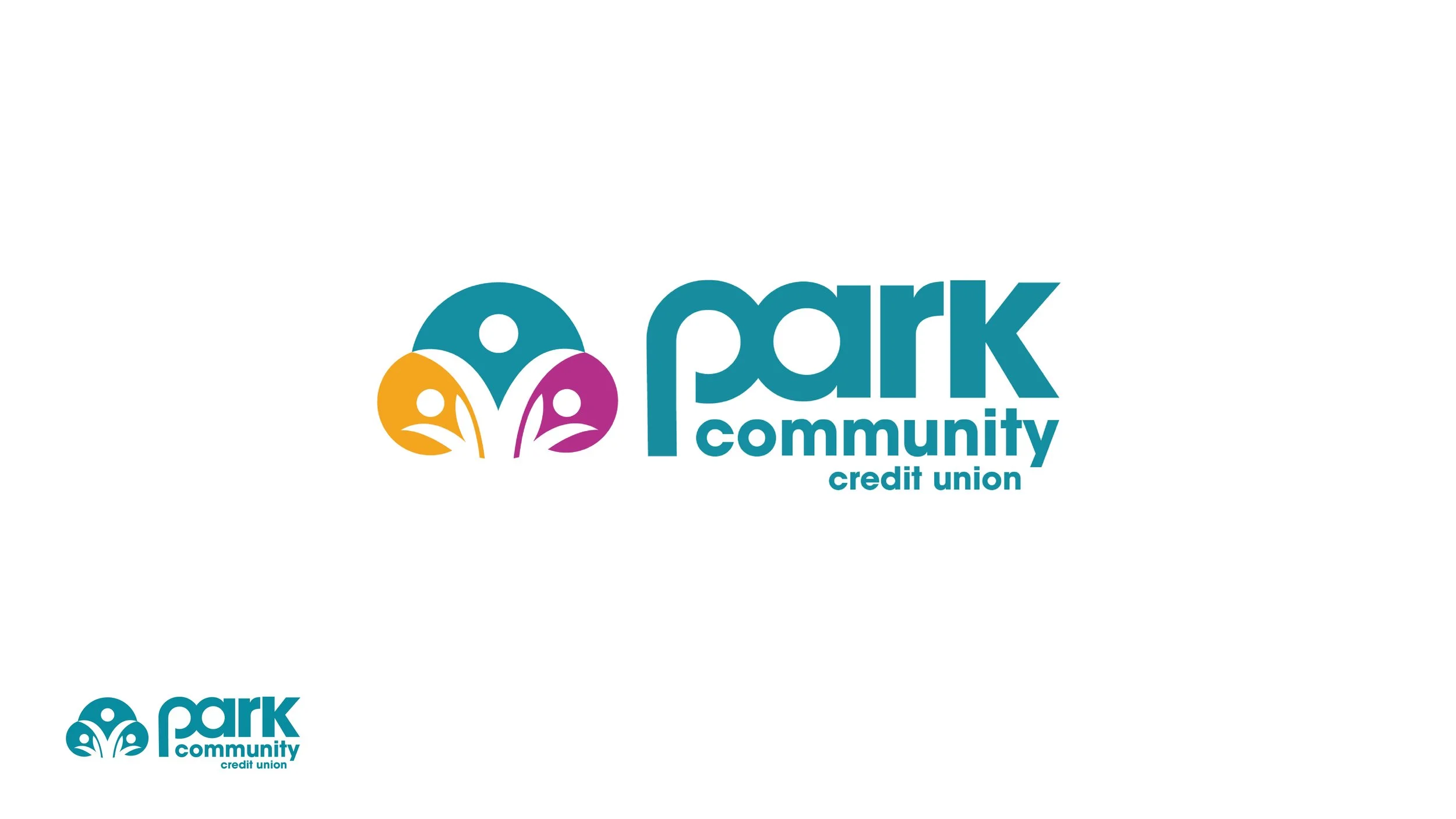
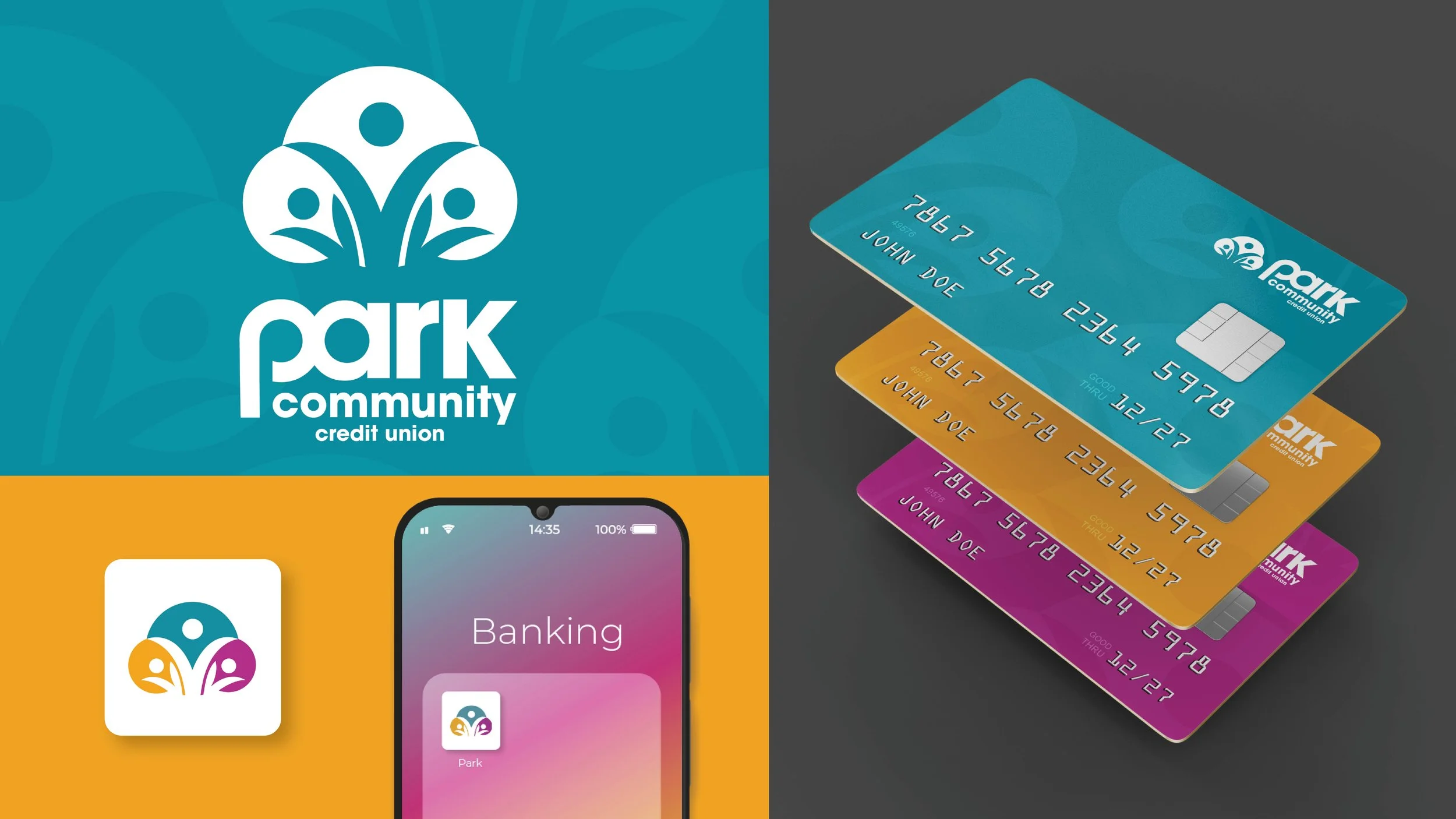
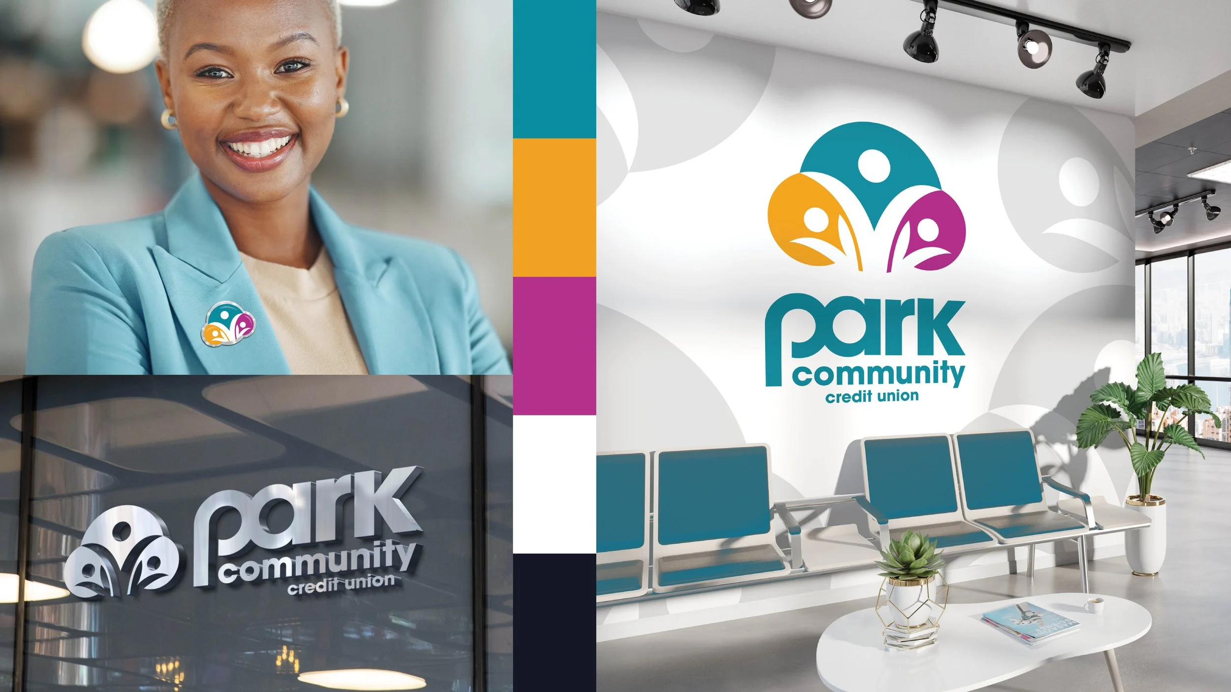
Park Community Credit Union
Our team was tasked with redesigning the logo and overall branding for Park Community Credit Union. The goal was to create a fresh, modern, and colorful identity that also felt fun and approachable. A key focus of the redesign was highlighting the idea of community — bringing together people from all walks of life. The new logo mark reflects this vision, emphasizing connection, inclusivity, and unity, while aligning with Park Community’s mission to serve and support its diverse membership.

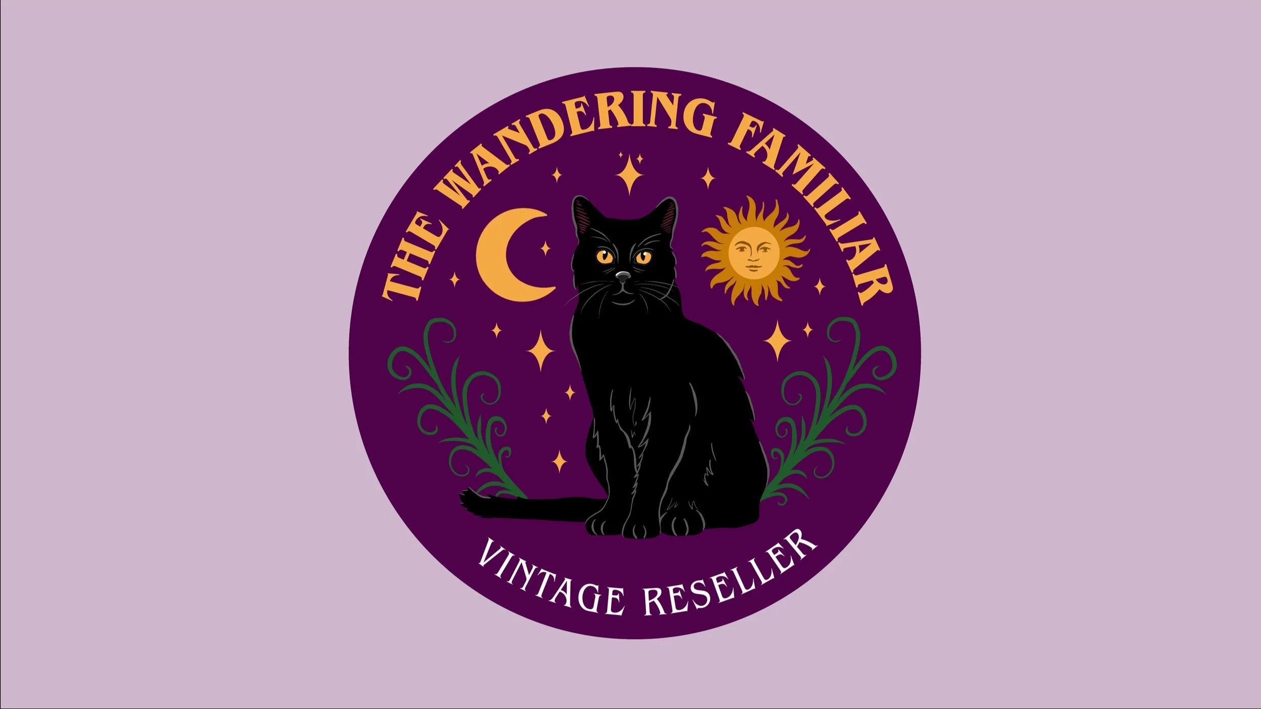
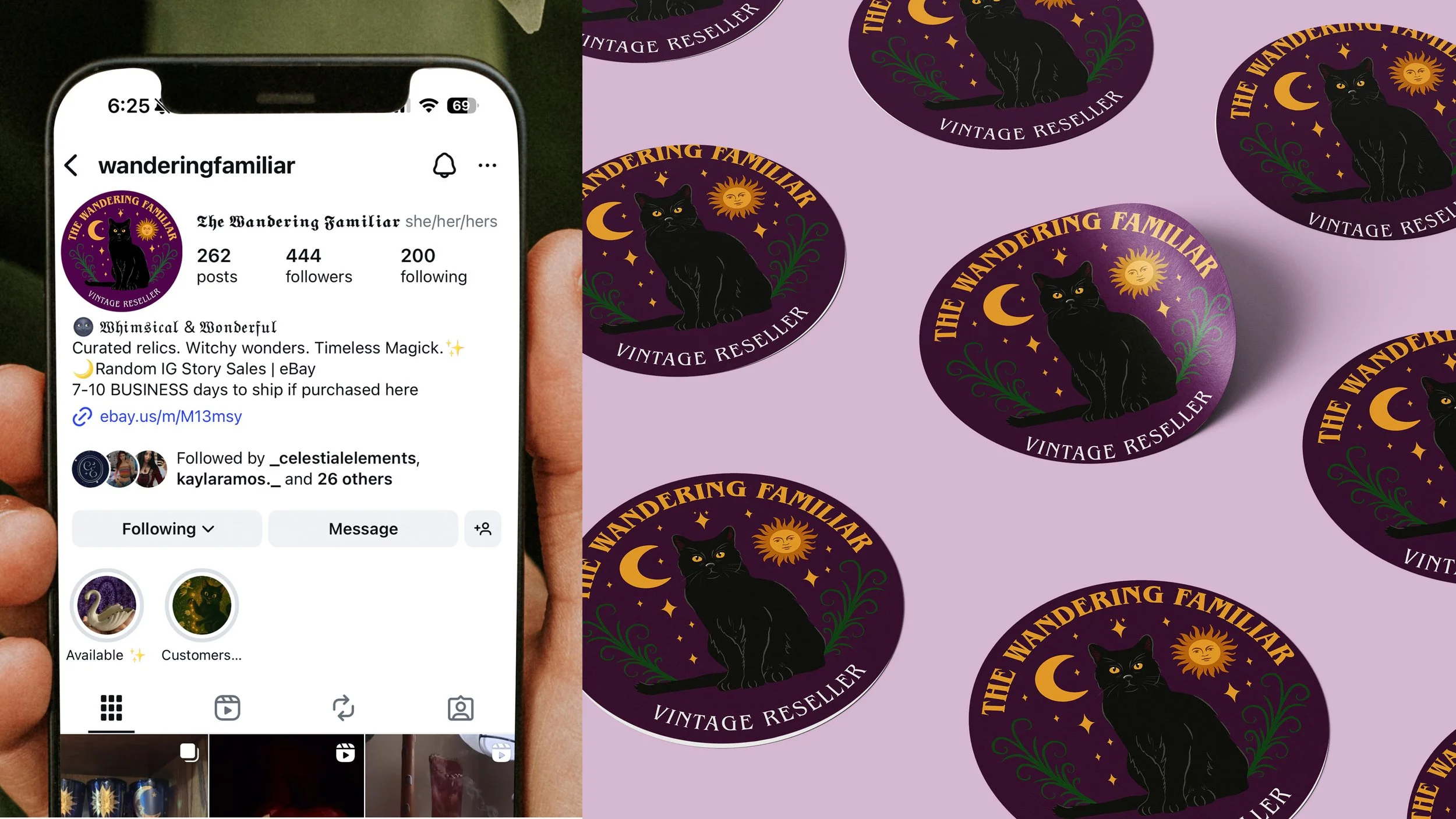
The Wandering Familiar
The Wandering Familiar is a small online shop specializing in 70s–90s vintage home décor and trinkets with a witchy, whimsical aesthetic. The client requested a logo refresh that would make her black cat mascot stand out more while retaining a dark plum background. This project presented a unique challenge—balancing low-contrast colors while maintaining visual impact. Through careful use of tone, texture, and contrast, the redesign enhances the cat as a focal point while preserving the moody, magical atmosphere central to the brand.